Back
Bean Den
Brand Identity
UI Design
This project was originally a test design task that was assigned to me when I was applying for a job in the early days of my career. I ended up loving the idea of the app and invested my time into researching further and designing a full-fledged flow for this app. As mentioned, I was tasked only with designing the UI for this app. I was given three personas to work with. The target users were young working professionals and students who are usually in a rush during the early hours in getting to work in time.
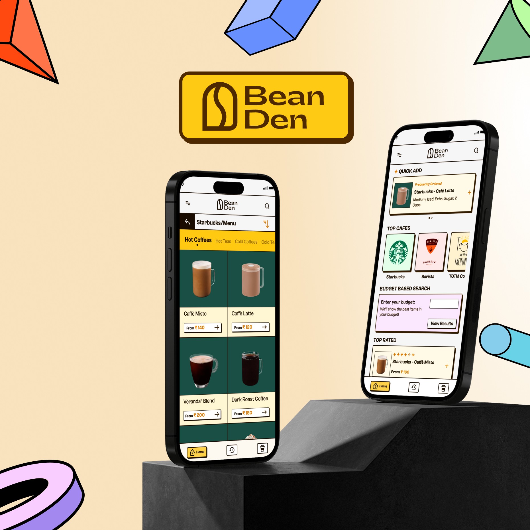
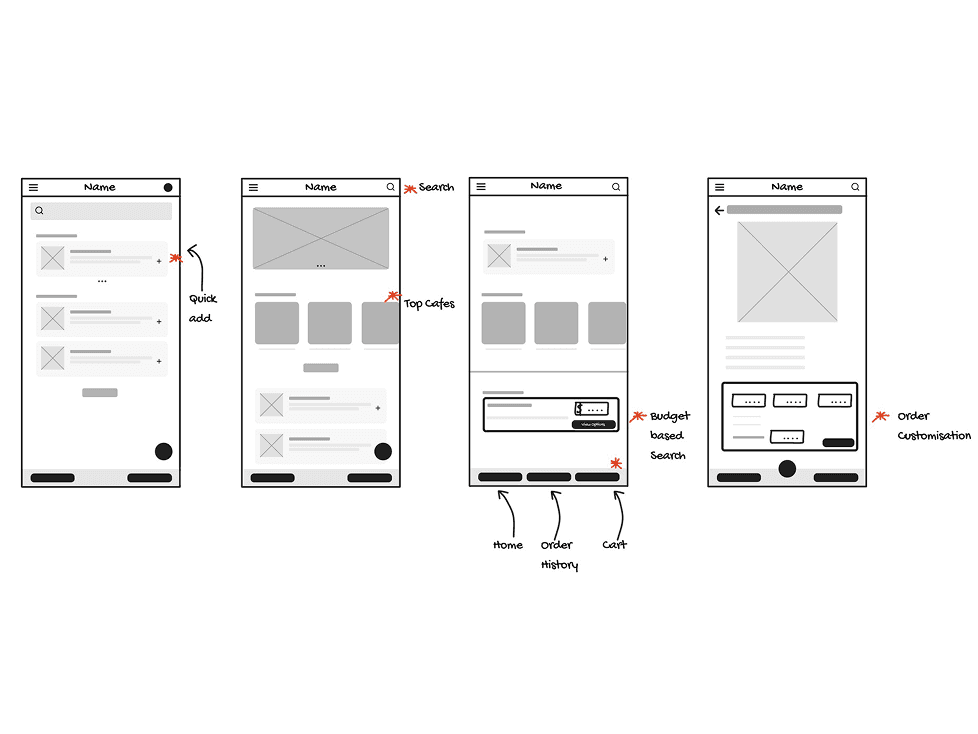
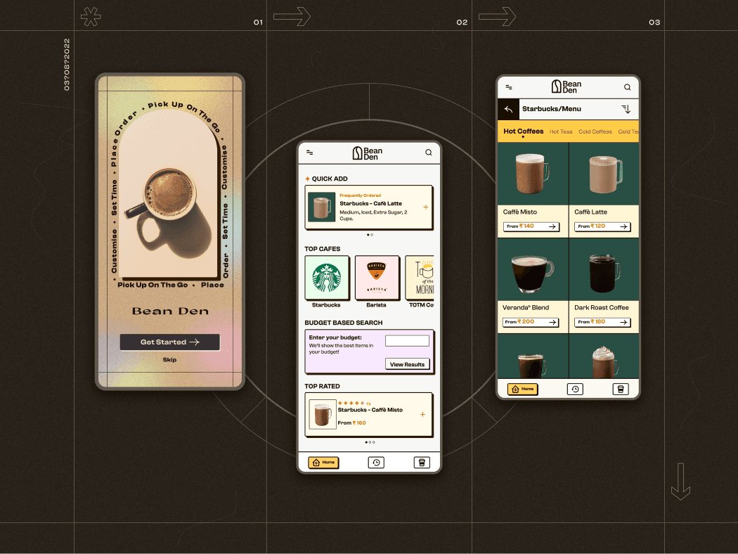
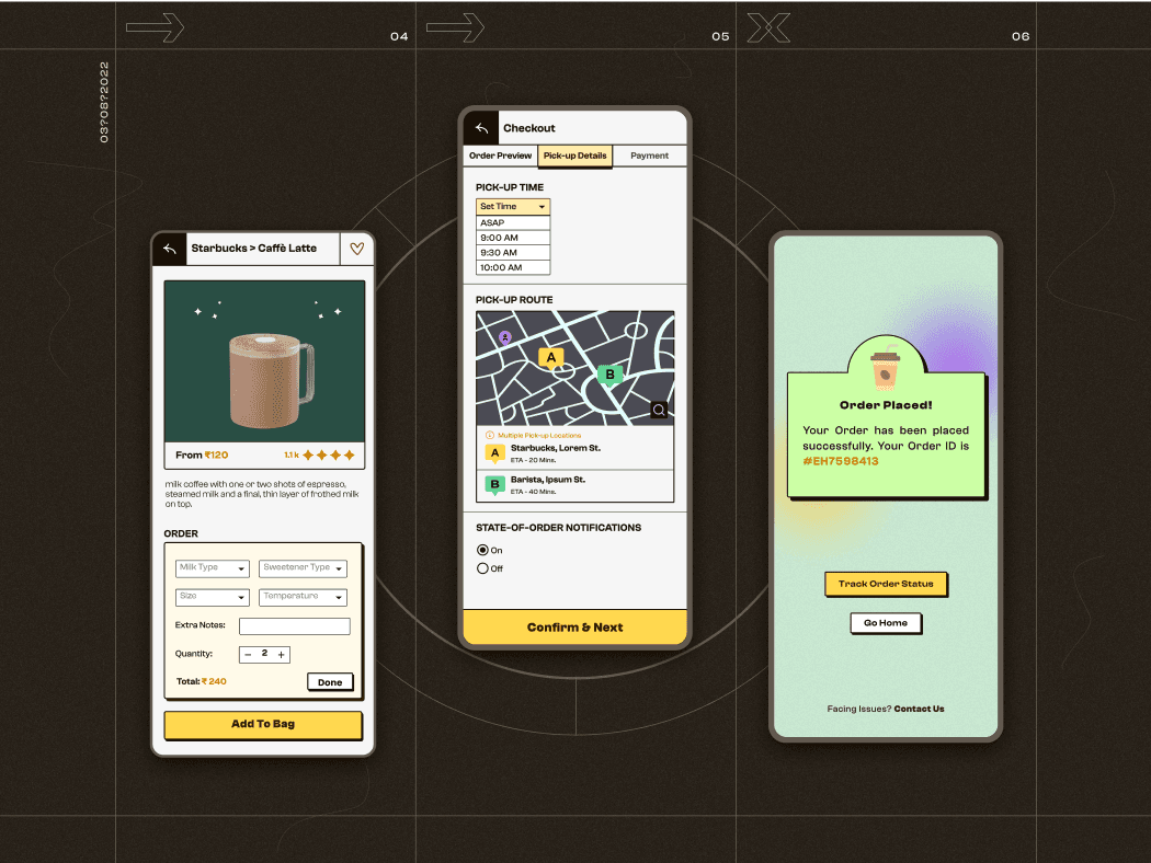
I designed an app that has accessibility and navigation front-and-center. My design philosophy for this app was ease-of-use and swiftness in placing orders. The user can find the feature they need with minimal effort. The homepage has a "Quick Add" feature that allows the user to quickly order their favorite/frequently ordered item. Top cafes' menus are readily available to browse through. And the "Budget Based Search", as the name suggests, allows the user to filter items based on their budget and get a bang for the buck. The orders are highly customizable to the extent that each café allows customization. Also, items can be 'favorited' to add to "Quick Add" in the future. The "Pick-up Details" screen gives the users all the info they need regarding picking-up their orders, be it from one café or many.
And for the UI, I noted that the majority of the end users are young adults; so I drifted away from the traditional UI themes and implemented "Neu Brutalism" theme which is very accessible but, at times, unconventional and bold. However, I made sure I don't go overboard with it, and didn't implement the extremes of Brutalism.
What initially started as a take-home task turned into a passion design project that I, to this day, have fun revisiting and making the smallest tweaks. This project is a reminder to me about how design is an innately iterative process.
You can also check out an older, more graphical version of this case study here.